Case study contents
UX Case Study · Enterprise AI · Healthcare
An AI copilot healthcare agents actually trust.
A fragmented contact-center workflow, rebuilt as one AI-assisted workspace with the actual product screens as the evidence.
Executive summary
Healthcare agents were drowning in software instead of listening to patients.
I led the end-to-end design of a workspace for agents who schedule appointments, manage prescriptions, and handle billing over the phone. First I consolidated four fragmented systems into one canvas. When testing showed that wasn't enough, I evolved it into an AI copilot that listens to the call and does the searching so the agent can focus on the patient.
It shipped as an MVP pilot, so I have no production metrics — and won't invent any. What follows is the research, the screens, and the pivot, built around one non-negotiable: the AI recommends, the human decides.
Project overview
Nextiva brought its unified CX platform into healthcare, where a "customer" is a patient and a mistake has consequences most SaaS never sees. I owned interaction design and strategy for appointment scheduling, rescheduling, prescriptions, and bill pay from research synthesis through the high-fidelity AI model.
Who it's for
Front-desk / patient-access agents, and the clinicians who inherit the outcomes.
What it does
Turns a phone call into a completed, correct action without the agent leaving the screen.
Why now
Voice is still the dominant channel in healthcare, and agents were absorbing that load with disconnected tools.
Business context
Every minute an agent spends hunting through screens is a longer hold, a longer call, and a higher chance the patient calls back. Healthcare was Nextiva's wedge: a high-stakes vertical where a unified, careful AI workspace could beat legacy telephony bolted onto legacy EHRs under HIPAA, integrations we didn't control, and agents measured on speed who can't afford to be wrong.
62% of calls go unanswered
At small businesses generally healthcare practices are among the most affected. — Forbes, 2024
76% report being overwhelmed
Healthcare leaders citing administrative workload as a primary strain. — Edge Research, 2026
1 in 3 patients leave
After just one bad experience with a provider they otherwise trust. — PwC
Industry figures cited from Nextiva's published healthcare research — market context, not results from this project.
My role
Lead Product Designer the single design owner end-to-end, alongside Product, Engineering, and a dedicated UX Research team.
Strategy & ownership
Led design for scheduling, prescriptions, and bill pay; translated research into a direction and defended it with stakeholders.
Craft
Flows, wireframes, hi-fi screens, and the AI copilot interaction model, authored from first principles.
Collaboration
Daily with PM and Engineering on feasibility; with Research to keep decisions evidence-based.
Through MVP
Stayed with the work from discovery into build, adjusting scope as the pilot took shape.
Research
A dedicated UX Research team led a mixed-methods study; I sat in on sessions, pressure-tested findings, and turned insight into decisions.
User interviews
How agents define a "good call."
Contextual inquiry
Real work, real environments the tabs, the holds.
Workflow analysis
The true path of a request across every system it touched.
Usability testing
Our designs against the workflows they were meant to fix.
What we learned
Agents wanted to help people, and the software kept getting in the way.
- Constant system-switching across EHRs and internal tools to finish one request.
- Fragmented patient info the full picture never lived in one place.
- The hold button as a crutch agents put patients on hold just to go find things.
- Call-backs as failure many requests couldn't close in one call.
- They wanted one workspace, not another tab to alt-tab into.
The problem
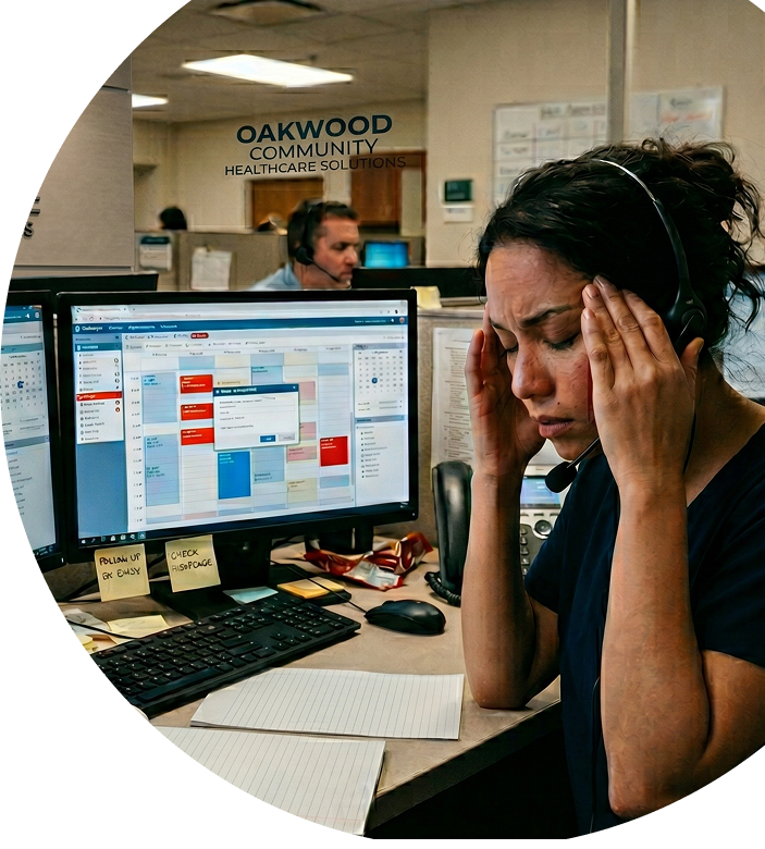
Agents carried the cognitive load of the entire system so the patient wouldn't have to and it was breaking down.
Patient information, scheduling, prescriptions, and billing lived in different systems. The problem wasn't that any single screen was badly designed it was that the work had no home.
How might we
The framing question
How might we let an agent complete a request in a single, unbroken conversation without holding the entire system in their head?
- Bring fragmented patient context into one place at the moment it's needed?
- Make scheduling feel like a decision, not data entry?
- Use AI to remove the searching without removing the agent's control?
Design goals
One canvas
End the alt-tab between scheduling, prescriptions, billing, and context.
Lower the load
System carries the memory work; agent carries the conversation.
Finish in one call
Fewer holds, fewer call-backs.
Trustworthy AI
Explainable, correctable, always subordinate to the human.
Keep it human
Give agents back the attention to sound like a person.
Safe by default
HIPAA and clinical reality at every step, without friction.
The workflow we were replacing
I mapped what actually happened on a call every branch, every screen an agent had to leave to go look something up. A single "book an appointment" request could touch identity, insurance, availability, and location, each in a different place.
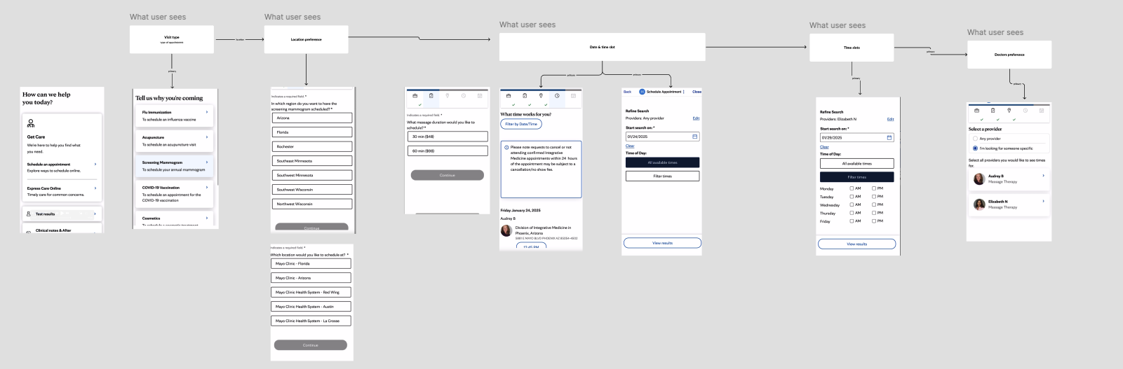
Iteration one — the manual scheduler
Everything in one place, with a structured flow: specialization, provider, consultation type, location, date, slot. Rescheduling reused the pattern with the current appointment pinned.
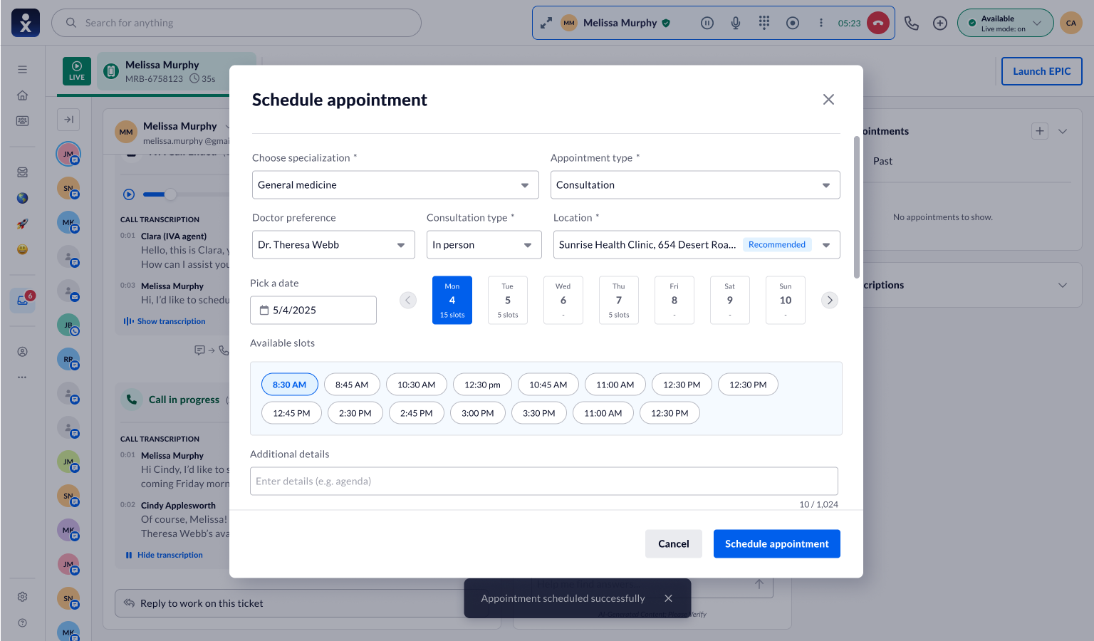
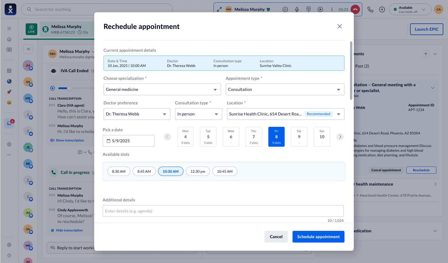
It removed the alt-tabbing. It also revealed the ceiling of "organize the chaos better."
Why it wasn't enough
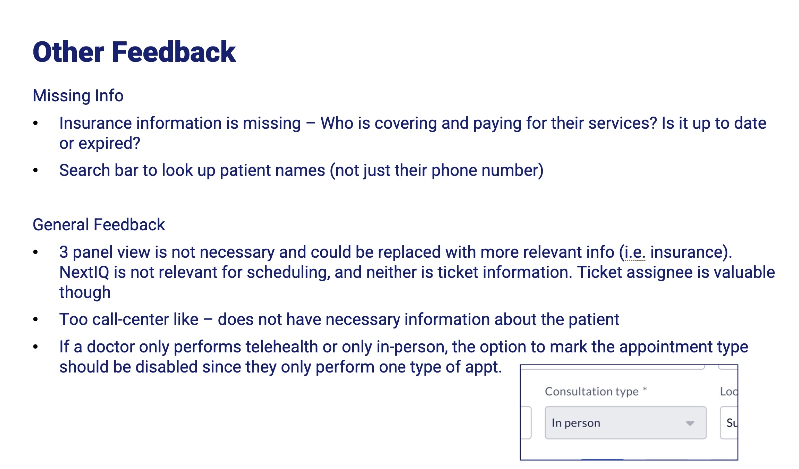
Tidy forms are still forms. The agent was still the search engine reading availability, typing while the patient waited. Here's the actual research readout that ended this iteration:
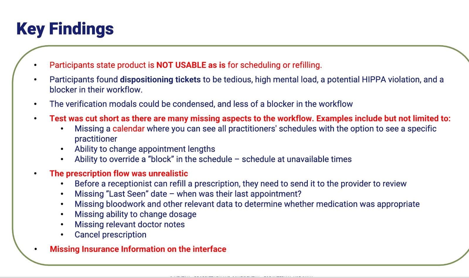
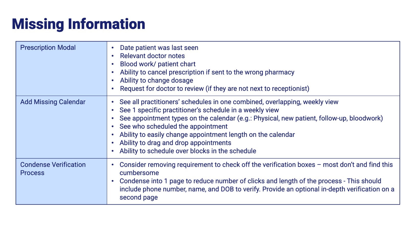
When every participant hits the same structural wall, that's not a preference it's a signal. It told me the next move wasn't a better form. It was a different kind of help.
The evolution — from tool to copilot
Don't make the search faster do the search for them.
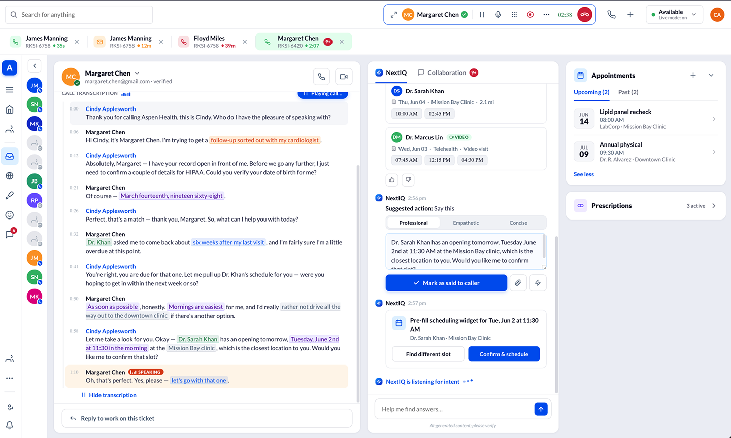
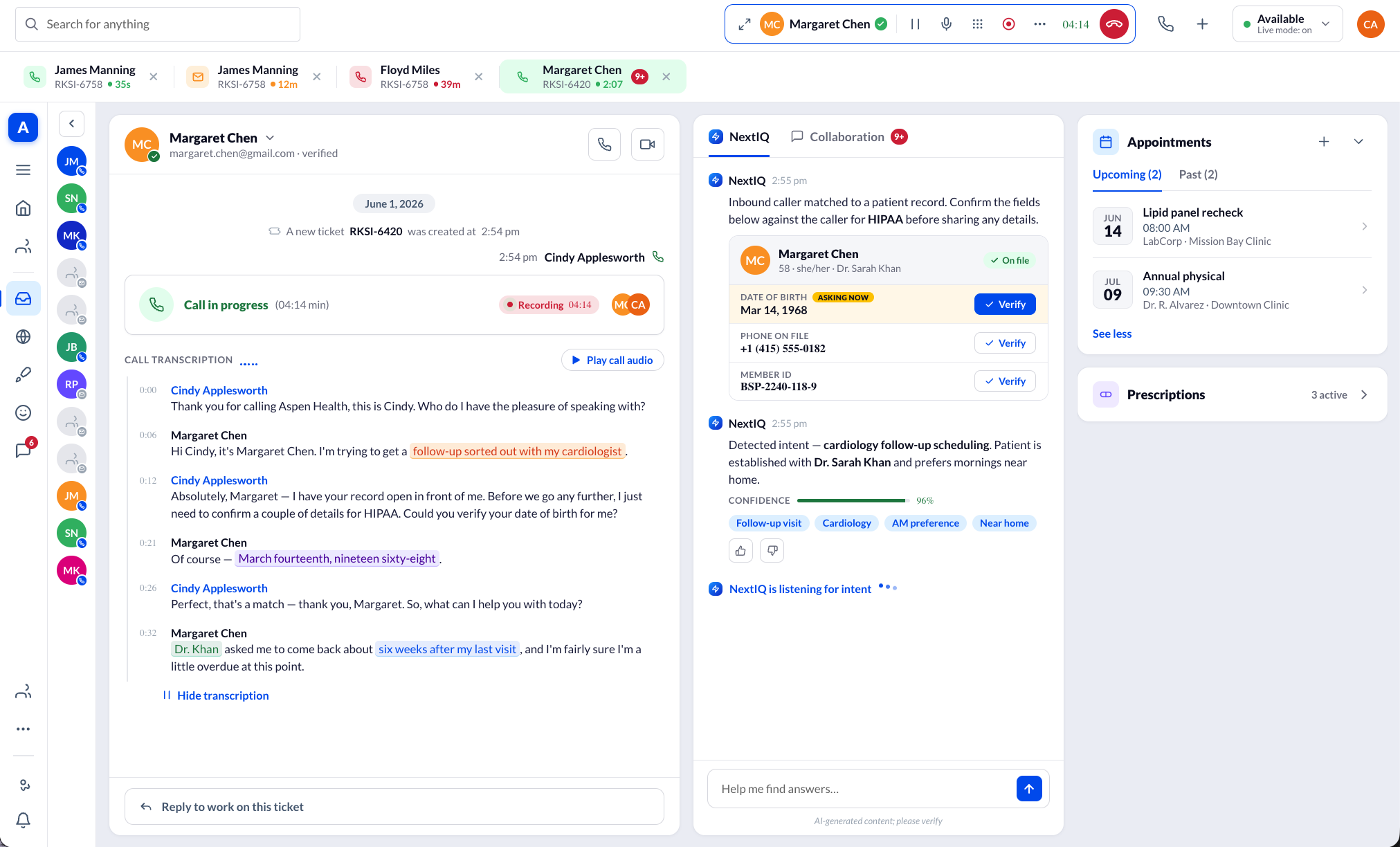
The product evolved from a manual workspace into an AI-assisted one. NextIQ listens to the live transcript, identifies intent in real time, and surfaces the appointment, prescription, or billing action the agent would otherwise go dig for.
- Agent searches provider availability by hand
- Types every field while the patient waits
- Holds the whole context in their head
- Copilot detects intent from the live call
- Pre-fills the booking; agent reviews & confirms
- Context is surfaced, not remembered
The copilot never took the wheel. The agent always reviewed, confirmed, or modified every recommendation. That was the design, and the thing I fought to keep see Section 17 for the disagreement it caused.
The AI copilot experience
I moved low fidelity to high, deliberately flows and component logic before pixels, in a tight loop with Engineering on what the AI could reliably do.
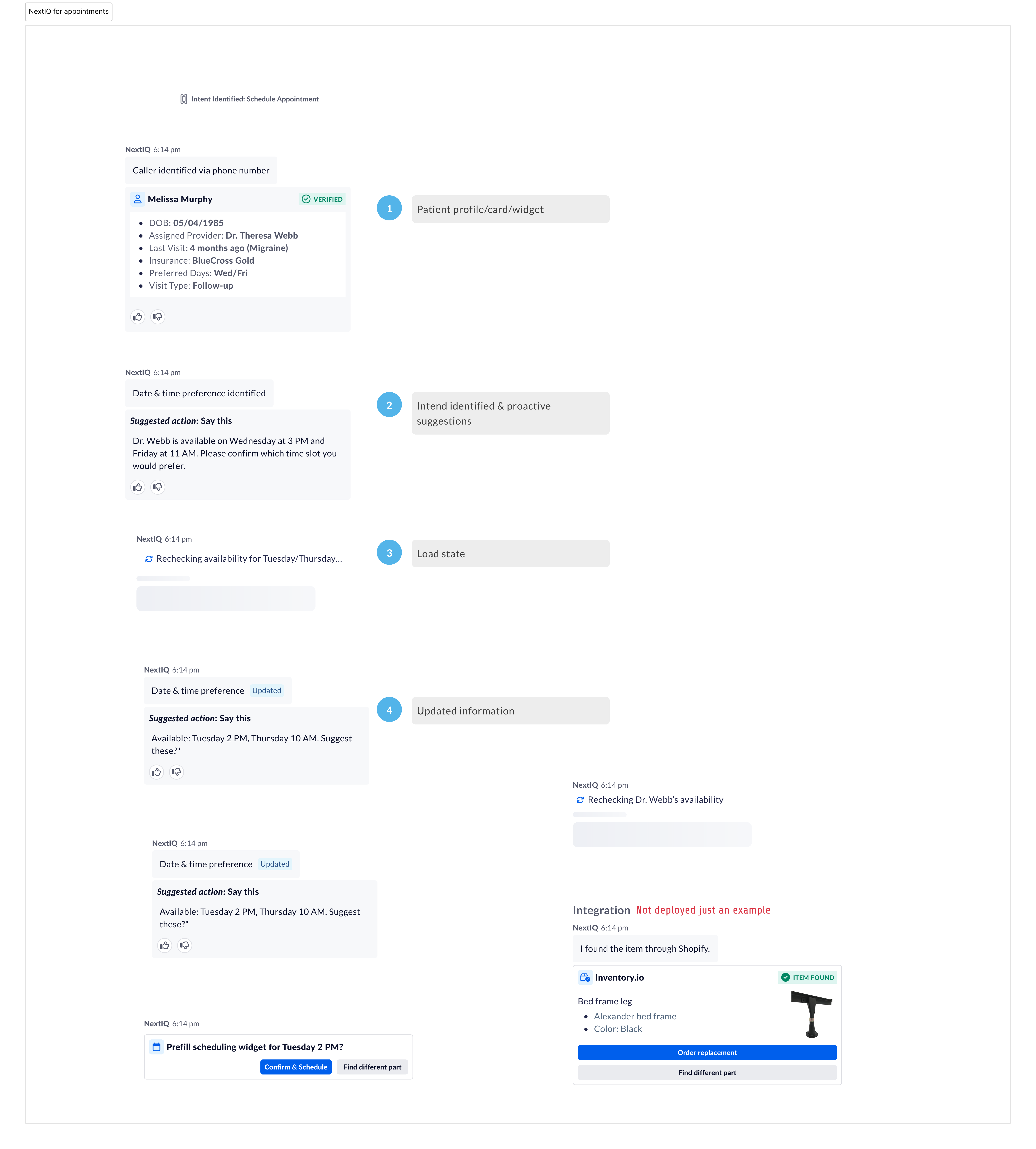
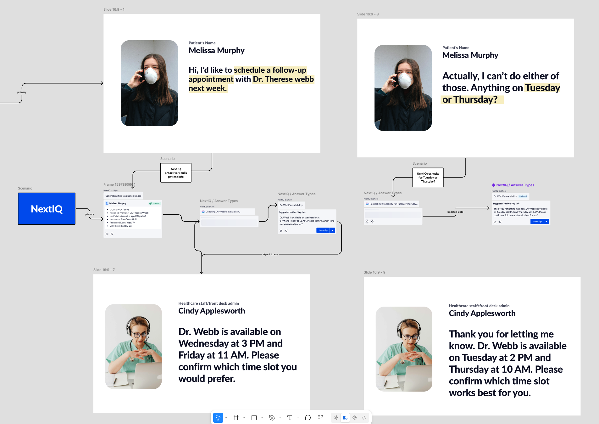
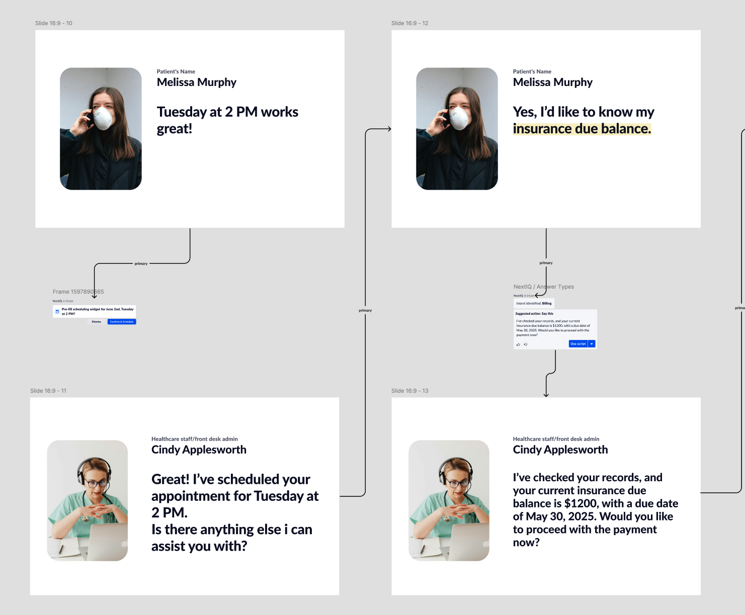
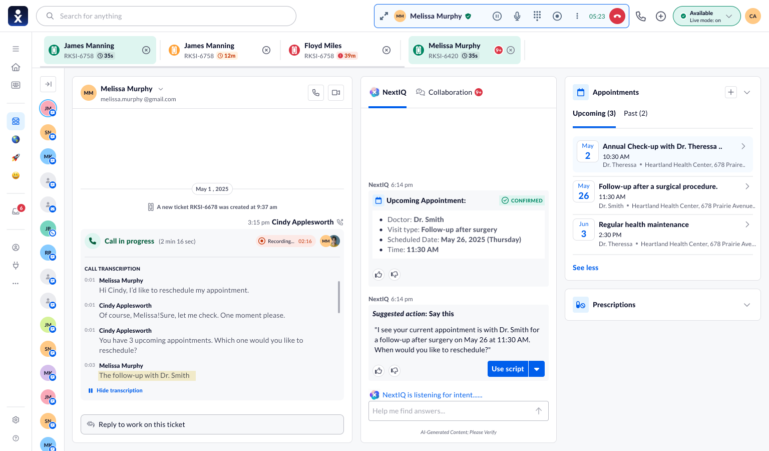
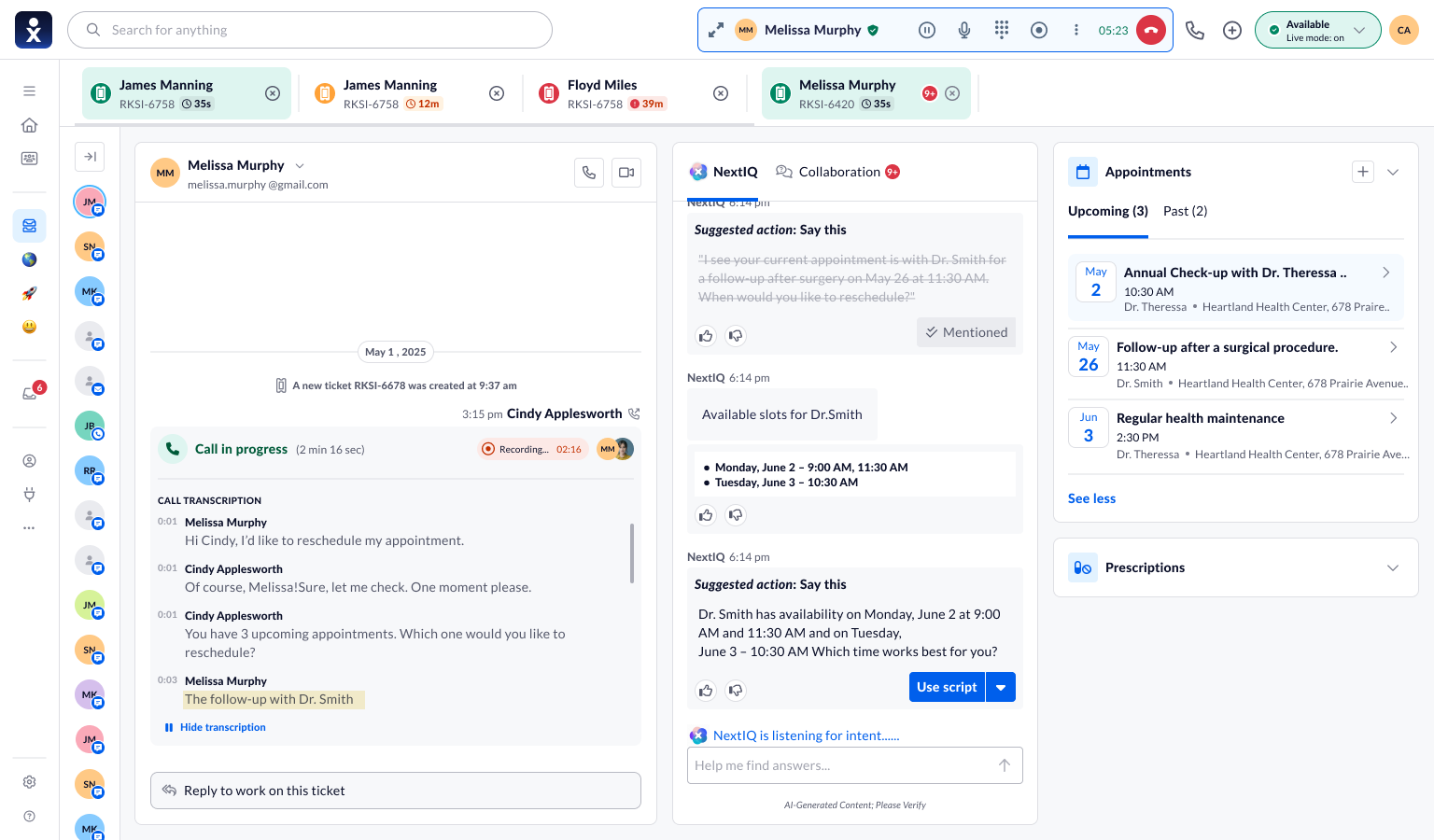
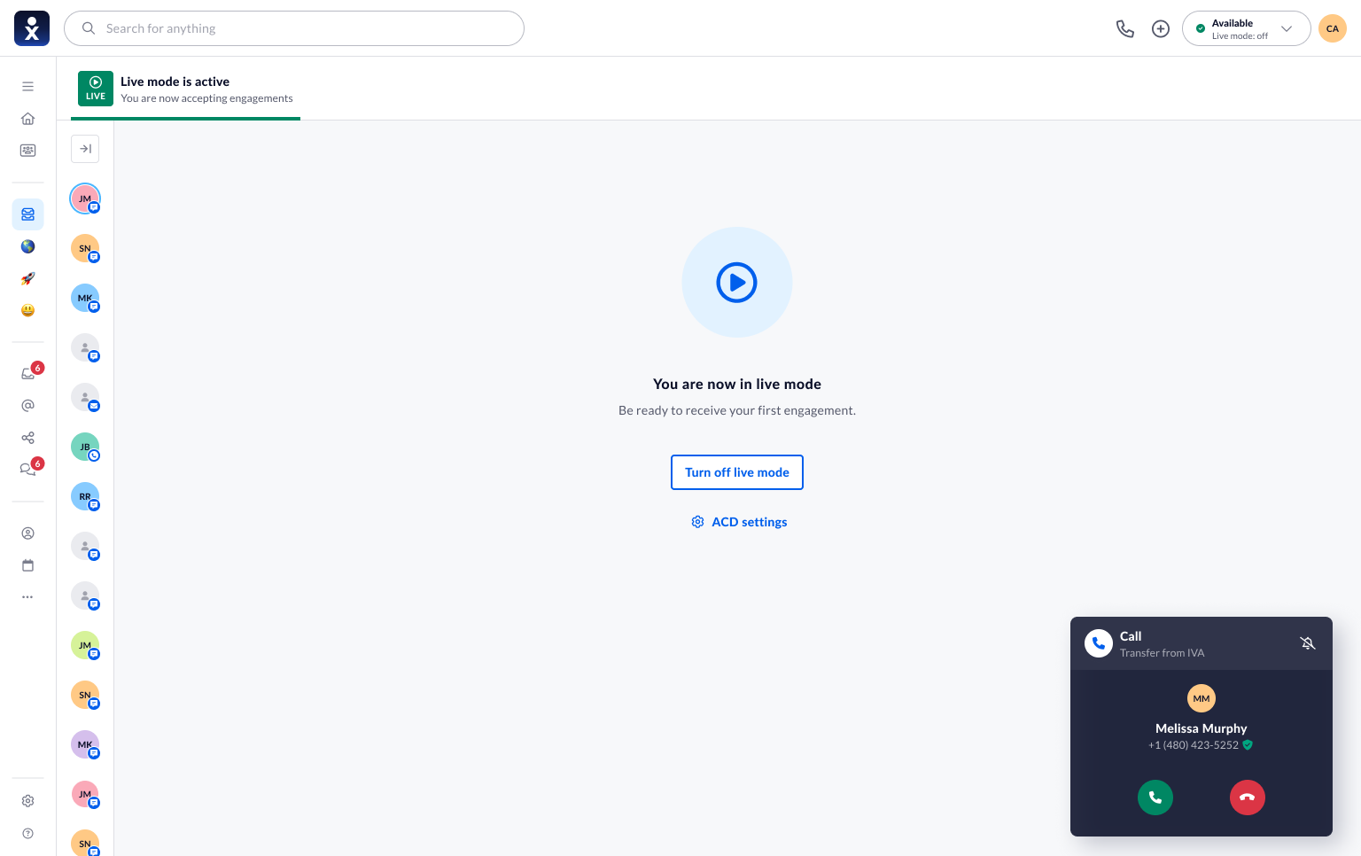
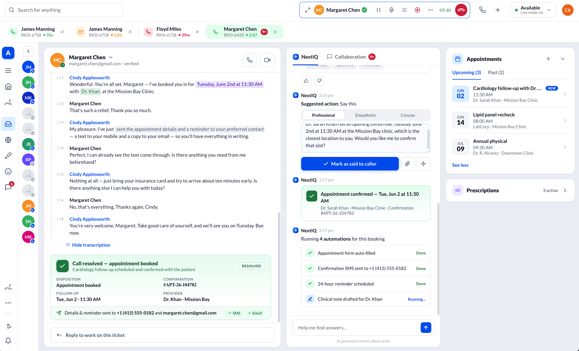
That process led to four real screens from the same call — the copilot's lifecycle, shown live rather than described.
See it in action
Drop a screen recording in as assets/copilot-demo.mp4 and it plays here automatically.
Interaction design decisions
Eight principles kept a powerful feature from becoming a reckless one.
Human-in-the-loop
The AI proposes; the agent disposes. Nothing reaches a patient without a human confirm.
Reduce cognitive load
Automate the searching and typing — not the judgment.
Progressive disclosure
Surface the next relevant thing, not everything.
Context-aware assistance
Grounded in this patient, this history, this moment.
Explainable recommendations
Every suggestion shows its evidence and confidence — never a black box.
Error prevention
Conflicts and low confidence are caught before confirm, not after.
Trust & transparency
AI output is always labeled, editable, reversible.
Graceful failure
When the AI can't help, it says so and steps aside — no dead ends.
The hardest: explainability under time pressure. Confidence became a glanceable signal; the "why" became a few chips — see Section 14's 96% confidence panel.
Trade-offs I made
Naming what I gave up, and why the trade was worth it, is how I keep a design honest.
Speed of verification vs. rigor
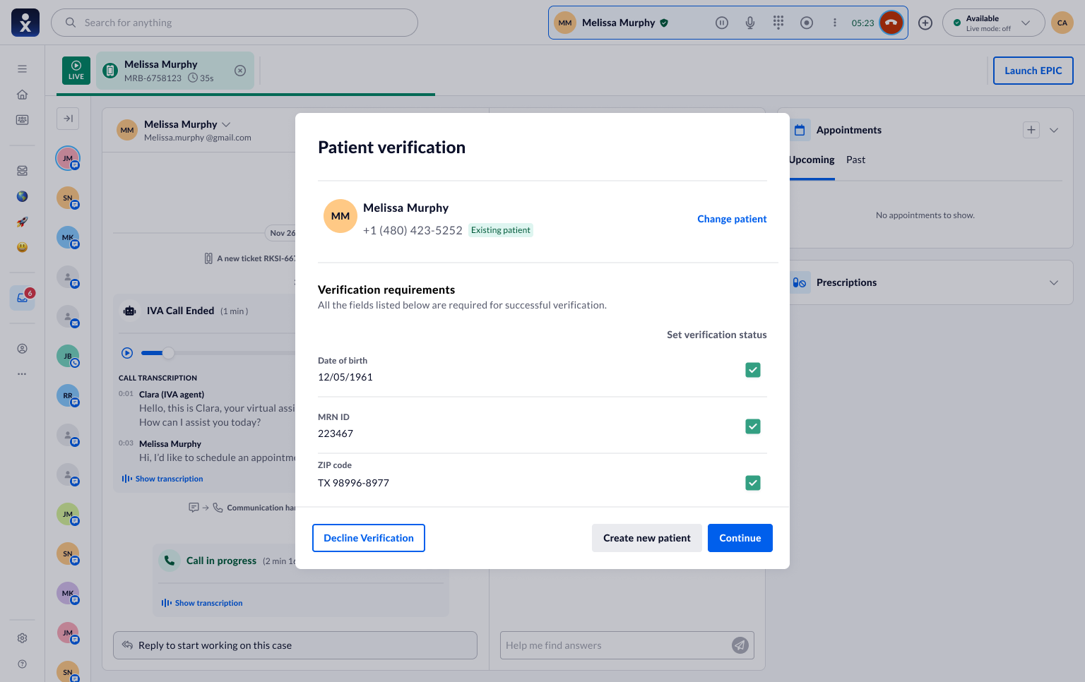
Chose an inline, glanceable HIPAA check over a full blocking modal every call.
Gave up a forced step-by-step, accepting rubber-stamping risk — mitigated by one field at a time, full modal reserved for new patients and mismatches.
Automation vs. trust
Chose pre-fill-and-confirm over letting the AI book and send on its own.
Gave up the flashier "it just does it" demo and one extra tap — gained a system agents actually rely on. (See Section 13 for the stakeholder disagreement behind this one.)
Simplicity vs. flexibility
Chose to keep the full, editable scheduler behind the AI's pre-fill instead of one-click booking.
Gave up the cleanest flow — the common real moment is "actually, can we change that?"
Usability testing
We tested both acts against realistic and messy scenarios — a patient who changes their mind, no available slots, a request a front-desk agent shouldn't complete at all. The manual version taught us its ceiling; the copilot version tested as the part of the job agents liked least, gone.
I watched for the failure I feared most — agents rubber-stamping suggestions. Designing the confirm as a deliberate, evidence-backed act was a direct response.
Designing for scale
A pilot with a handful of agents doesn't prove the design holds at enterprise scale. What I addressed, and what's still open:
- EHR variance — the graceful-failure principle exists specifically for this: when the AI can't reliably read a given EHR, it says so and steps back to manual.
- Language and accessibility — the pilot ran English-only; multilingual handling and screen-reader support for confidence chips are open V2 questions.
- Volume — at scale the risk isn't the UI, it's intent-detection latency and accuracy under load, which needs tighter ML/Engineering monitoring.
Testing also forced states I hadn't drawn yet — cancellations, no-shows, re-verification — before they became production bugs.
MVP launch
The product shipped as an MVP pilot — a scoped, real-world test, not a full rollout. Production metrics don't exist yet, and I won't manufacture them. "Launch" meant readiness: a coherent, safe, buildable experience that clinical stakeholders were willing to put in front of real agents.
Outcomes
Honest, qualitative, and enough to justify the next investment:
Stakeholder validation
Product and clinical stakeholders backed the reframe and the AI model, clearing it for pilot.
Prototype usability gains
Later prototypes tested measurably better than the manual baseline in session.
Reduced complexity
Fewer steps and screens to complete the core scheduling task.
Less context-switching
One canvas replaced the alt-tab loop between systems.
Faster in-session completion
Observed quicker task completion during usability testing — not a production claim.
Agent confidence
Agents felt more in control once overriding the AI was obviously easy.
Industry impact, at scale
50%+ cost reduction
"As long as my network stays up, my phone lines are good." — Patrick Miller, IT Manager & Information Security Officer, Mountains Community Hospital
500+ employees, 22+ locations
"They know healthcare. Fully HIPAA-compliant infrastructure from top to bottom." — Ron Stipp, Director of IT and Security, Horizon Health
Overnight, seamless migration
"Staff came in the next day and didn't know that we did anything different." — Jake Haacker, CIO & Security Officer, Horizon Health
AI-powered knowledge base
"Has redefined our ability to assist our members." — Brianna Brennan, Chief Innovation Officer, Ontrak Health
Transcription & routing
"Its simplicity lets us implement solutions tailored to our needs." — Gabriel Miranda, Chief Information Officer, NEBA Health
HIPAA-compliant platform
"Ensuring we were on a secure, tested, and validated platform was the highest priority." — Joseph Berardo, CEO, Concordia Care, Inc.
Lessons learned
- Consolidation is table stakes, not the win. The real leverage was changing who does the searching.
- In AI products, trust is the feature. The moment agents could override the copilot, they started relying on it.
- Design the AI's humility. How it admits doubt mattered more than how clever it was on a good day.
- Test the model, not just the screens. The manual scheduler looked fine and tested poorly, because the problem was structural.
Reflection as lead product designer
My job wasn't to design the smartest AI in the room — it was to design the relationship between a stressed human and a fallible machine, where being wrong isn't an option. I made the case for a pivot when a tidy first version tested well enough to ship and not well enough to matter, and held the line on human control when a stakeholder pushed for more automation than I believed was safe.
A V2 starts with the real practitioner calendar agents asked for, and billing and insurance made permanently visible. The principle carries into everything I design now: for enterprise AI, copilot, never autopilot.